Introduction
In this section, I will introduce my own shiny app, named covid-19 and creatd by shiny Chang et al. (2020) package. As we all know, from January 2020, COVID-19 broke out in China, and then spread to the world in March, and upgraded to a global pandemic. (The following figures are create by knitr Xie (2014) package)
Therefore, the main purpose of designing this app is to let users better know the daily situation (See Figure 1) and the global change trend of COVID-19(See Figure 2). You can use textbox in the table which is created by DT Xie, Cheng, and Tan (2020) package or just click on the point in the interactive plot which is created by plotly Sievert (2020) package.
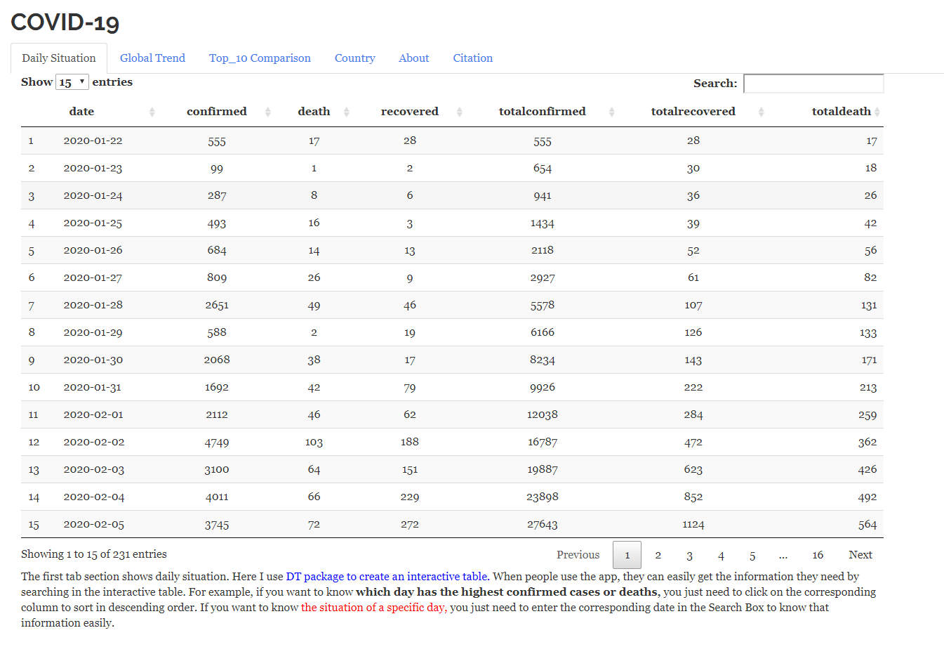
Figure 1: The daily Situation
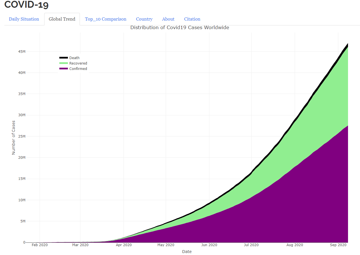
Figure 2: The Global Trend
Also, I have specifically listed total situation of all the recorded countries in the table(See Figure 3) which is created by kableExtra Zhu (2019) package and ten countries with the most serious epidemic situation in the plot (See Figure 4) which is created by ggplot2 Wickham (2016) package, so that you can learn some lessons from their experiences.
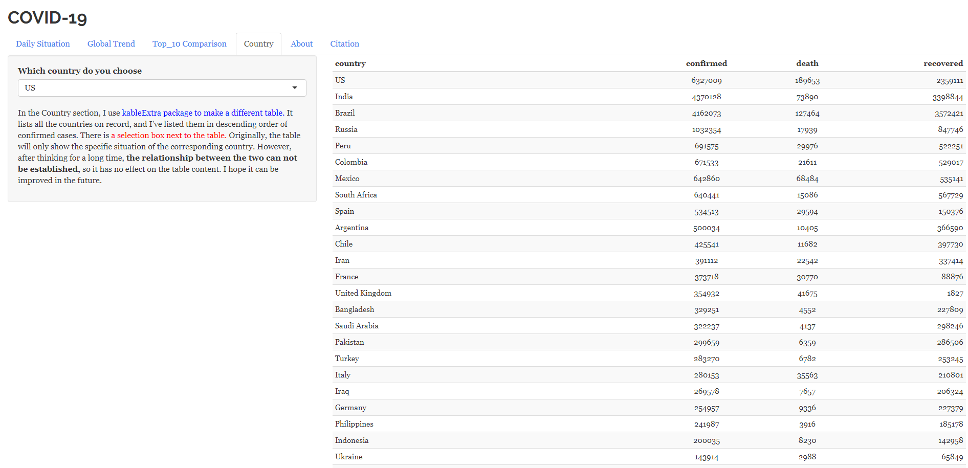
Figure 3: Each country Situation
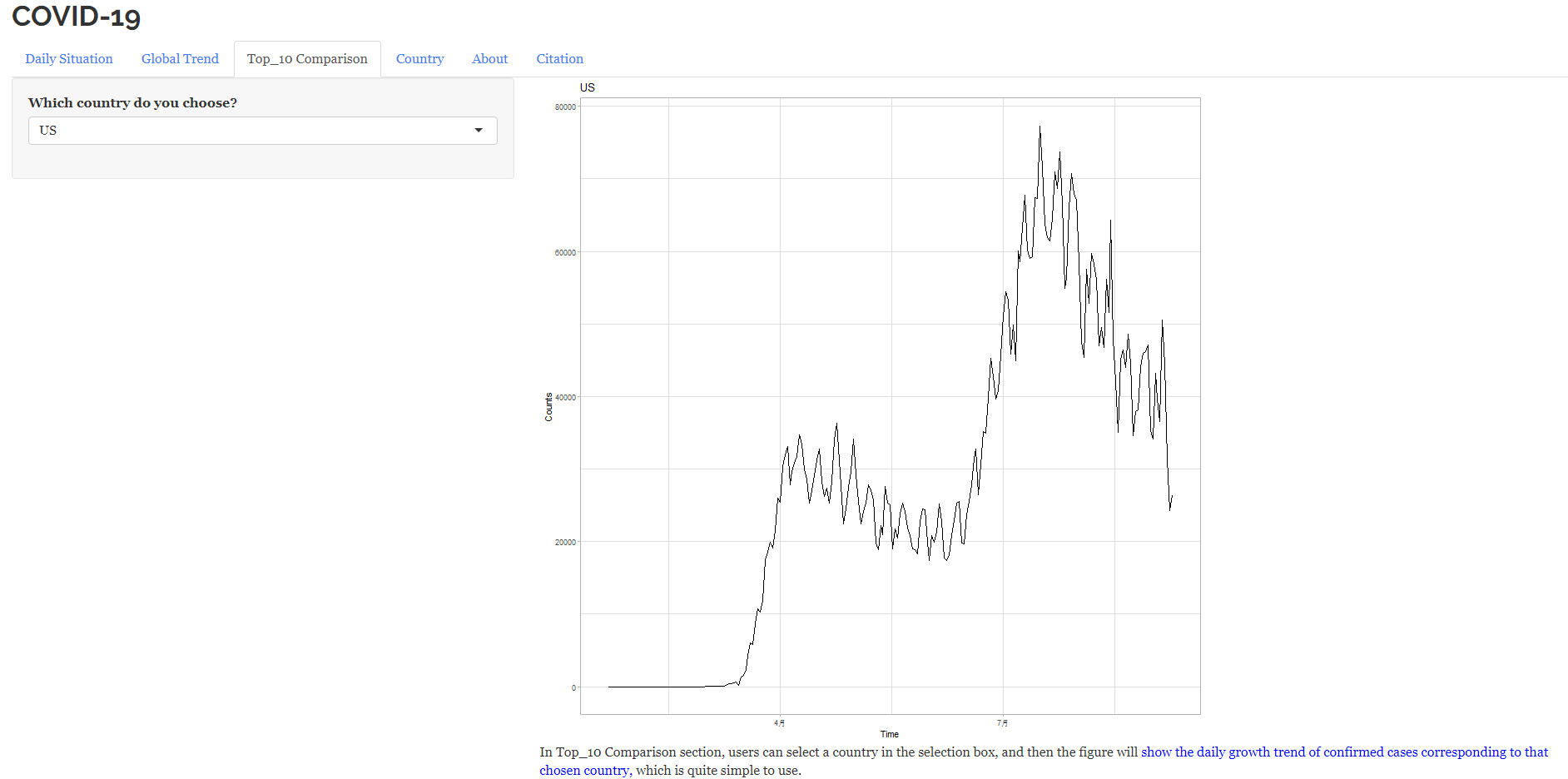
Figure 4: Top 10 Countries with the Most Confirmed Cases
Noted
Although the content of my shiny app is not rich, it is enough to understand the basic knowledge of COVID-19 and the anti-epidemic efficiency of some countries. The purpose of the direct name ‘COVID-19’ is to let users understand the fields and knowledge of the shiny app simply and directly.
Chang, Winston, Joe Cheng, JJ Allaire, Yihui Xie, and Jonathan McPherson. 2020. Shiny: Web Application Framework for R. https://CRAN.R-project.org/package=shiny.
Sievert, Carson. 2020. Interactive Web-Based Data Visualization with R, Plotly, and Shiny. Chapman; Hall/CRC. https://plotly-r.com.
Wickham, Hadley. 2016. Ggplot2: Elegant Graphics for Data Analysis. Springer-Verlag New York. https://ggplot2.tidyverse.org.
Xie, Yihui. 2014. “Knitr: A Comprehensive Tool for Reproducible Research in R.” In Implementing Reproducible Computational Research, edited by Victoria Stodden, Friedrich Leisch, and Roger D. Peng. Chapman; Hall/CRC. http://www.crcpress.com/product/isbn/9781466561595.
Xie, Yihui, Joe Cheng, and Xianying Tan. 2020. DT: A Wrapper of the Javascript Library ’Datatables’. https://CRAN.R-project.org/package=DT.
Zhu, Hao. 2019. KableExtra: Construct Complex Table with ’Kable’ and Pipe Syntax. https://CRAN.R-project.org/package=kableExtra.